Readability of Websites, Emails and Even Your Phone Screen Can Become an Issue as You Age

Why would someone create a website and not make it readable?

I have a pet peeve that I need to get off my chest. I call it the “graying of the internet.”  Here are some examples:

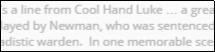
> Website designers are fond of using sans serif fonts in smaller sizes and 50% black — in other words gray! Here is an extreme example from one such website:

Why would anyone create a website, then make it hard to read? 

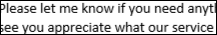
> The default font for many email programs such as Outlook, which I use, is 11 pt. Calibri, which looks like this:  

At least it is black, not gray, and it looks big enough.  On a computer screen, however, there’s no need for type to be so small.  I changed the default on my outgoing emails to 14 pt. Georgia, the most readable serif font.

> The default font on the iPhone can be made more readable. Under Settings, click General, then Accessibility.

I’ve created a web page, www.ReadabilityYes.info, with instructions for changing the default font on four popular email programs — Gmail, Microsoft Outlook, AOL and Mail.

The Graying of the Internet — What About Readability?

I’ve written before about the subject of readability, both in print and online — a subject that is dear to me not only as a senior citizen with naturally reduced visual acuity, but as a former typographer trained in what makes one font more readable than another.

It’s bad enough that more and more publications and most web pages use sans serif fonts like Arial, but there’s another strange trend of graying those typefaces — literally.  Have you noticed?

This font is Times Roman. Most websites use sans serif fonts like Arial and they display them in gray type instead of black type, compounding the unreadability! Why publishers and webmasters would choose to reduce the readability of their product in this way is beyond me.

In an ideal world, sans serif fonts such as Arial would be used only for headlines, bigger and bolder. On the other hand, body text like you’re reading here should be in a serif font such as this Times Roman or, my favorite, Georgia.

You can join me in my quest. Start by changing the default font in your email program to your favorite serif typeface.

PS: I can celebrate that starting this week, the Denver Post is allowing my column to be in Times Roman instead of Arial, which was required previously, so we are making progress!